Blog Title
Thursday, September 11, 2025
Wednesday, August 20, 2025
from Imgflip Meme Generator
Saturday, November 26, 2022
LGM Pics
Wednesday, June 29, 2022
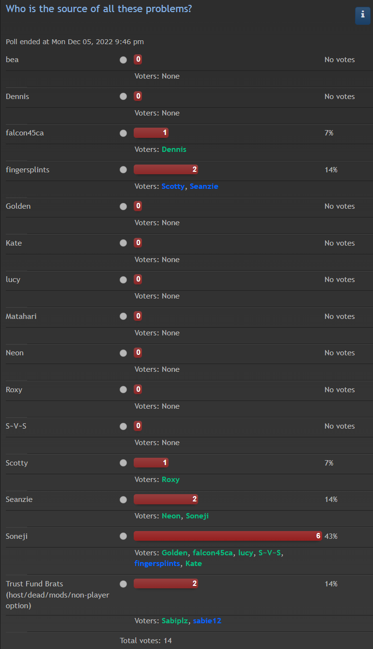
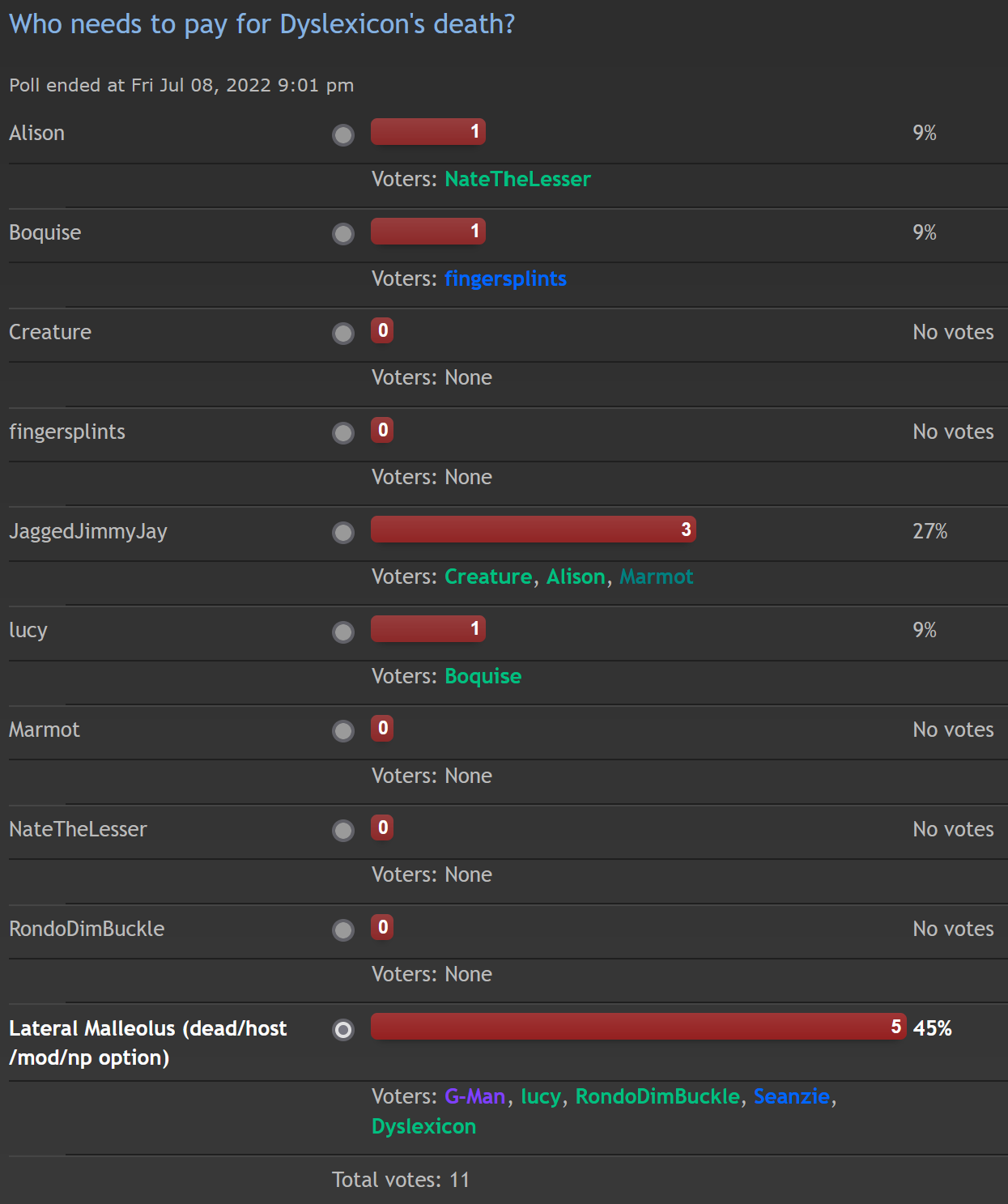
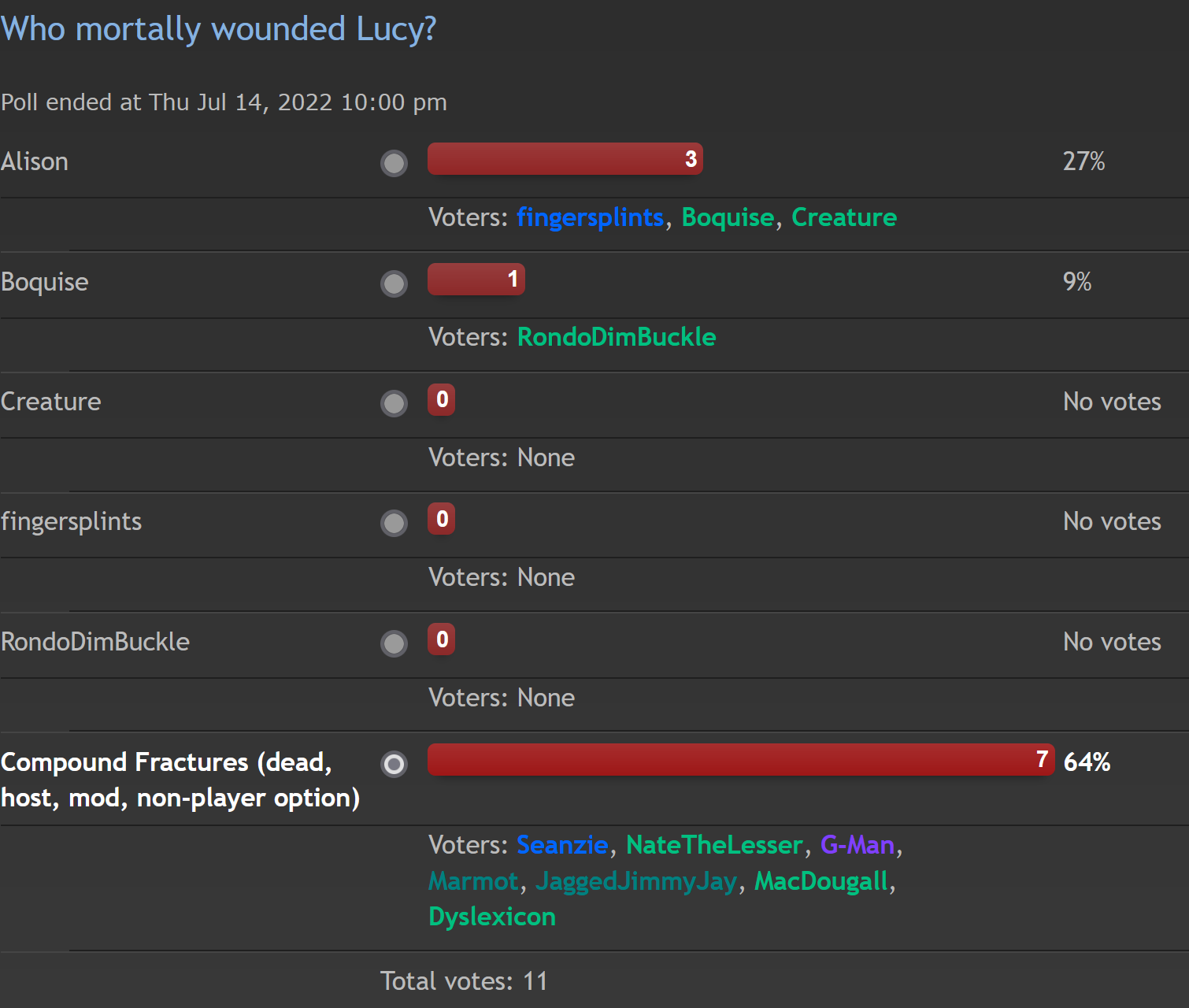
Halvosen Ridge Polls
x
x
x
x
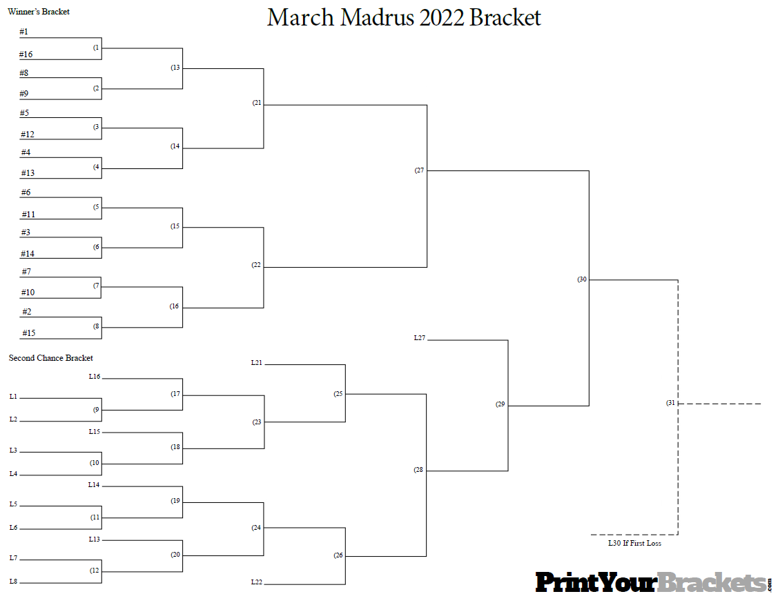
Wednesday, March 2, 2022
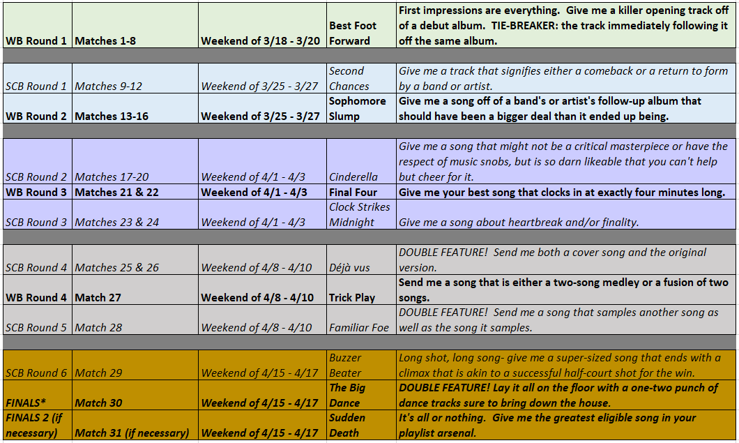
March Madrus
x
x
Saturday, October 9, 2021
aifaM pics
x
x
x
x
Monday, March 22, 2021
Good Cop Bad Cop Pics
Older Posts
Home
Subscribe to:
Posts (Atom)
Blog Archive
▼
2025
(2)
▼
September
(1)
►
August
(1)
►
2022
(3)
►
November
(1)
►
June
(1)
►
March
(1)
►
2021
(2)
►
October
(1)
►
March
(1)
►
2020
(2)
►
August
(1)
►
May
(1)
►
2019
(1)
►
November
(1)
►
2018
(6)
►
October
(1)
►
July
(1)
►
April
(2)
►
March
(2)
►
2017
(5)
►
August
(1)
►
April
(1)
►
March
(2)
►
February
(1)
►
2016
(7)
►
December
(1)
►
October
(1)
►
September
(2)
►
April
(1)
►
February
(2)
►
2015
(7)
►
September
(1)
►
August
(1)
►
July
(1)
►
June
(3)
►
May
(1)
►
2010
(1)
►
August
(1)
►
2009
(6)
►
December
(2)
►
October
(4)
About Me
G
View my complete profile